
Herb Trimpe is a bit like Kirby in that some people just don't like his stylistic approach. A far cry from the photo realistic Bryan Hitch clones that seem to be the norm of today, Trimpe's art embraces a simplicity and dynamism that you rarely see now. His style has been praised by many comic luminaries including Erik Larsen.
Here are some of my favorite covers from his prodigious seven year run on the Hulk with some reasons why I like them.
159 – Two Years Before The Abomination
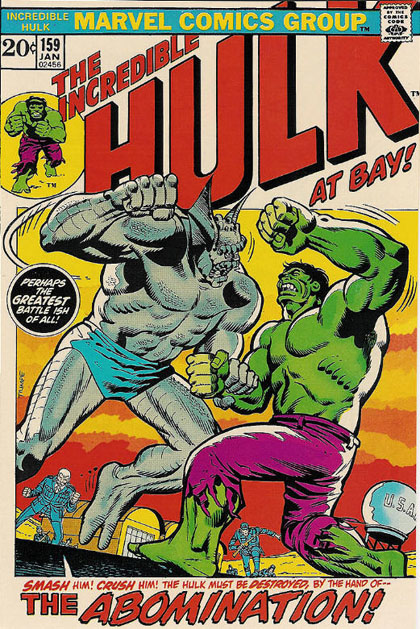
In all fairness, this cover isn't on this list because of the art. (It's actually one of the poorer examples of Trimpe's skills.) The reason I picked this one was because this was first modern Hulk comic I ever bought during my collector
phase of my life. (I had sampled a few issues as a wee lad during the late 60's, but nothing had stuck.) This was issue wherein I experienced reading a story that referred to events from several years ago.
Year spanning continuity?! At the time, the idea that these stories could go on for years was staggering.
Also, this cover added the tagline At Bay! The next time we see that tagline was also an issue that featured the Abomination. (We'll get to that cover in a bit.)
160 – Nightmare At Niagara Falls
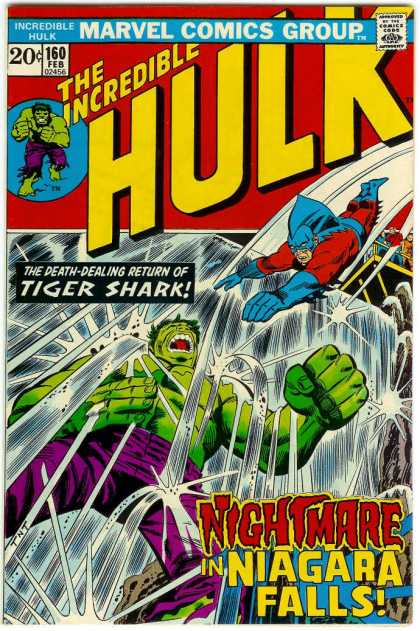
This is a MUCH better example. Check out the the way we are viewing the scene from such a distorted angle here.
164 – Phantom From 5,000 Fathoms!
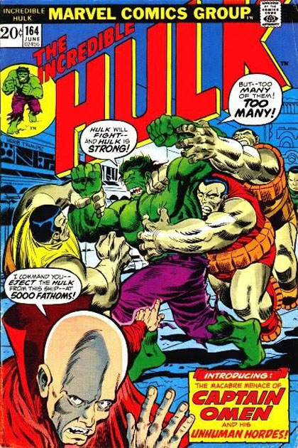
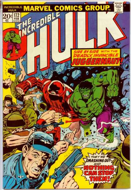
Trimpe uses the technique of having a character break proscenium on this cover and he will use it again on 166 and 172 And Canst Thou Slay... The Juggernaut? (another one of my all time favorites.)
169 - Disaster Eight Miles High
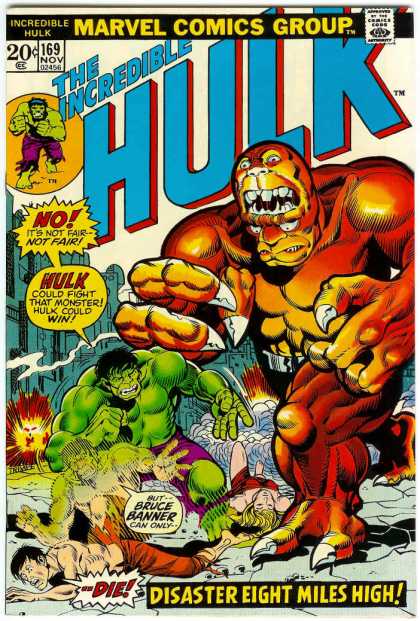
This is cool because of how the transformation scene gets played out on the cover.
171 – Revenge!
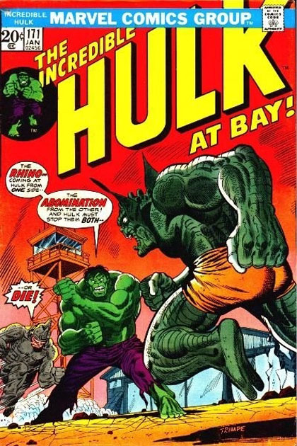
Easily my all time favorite issue from this time simply because of the battle royale between Hulk, Rhino and The Abomination. The cover is great too because it almost has a 3D effect with the way perspective has been used to heighten the drama.
173 – Anybody out There Remember...The Cobalt Man?
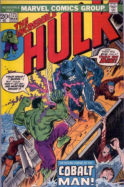
Trimpe tilts the ship in this cover to make the fight scene more
exciting. As a result, it gives him room to draw the figures a bit broader than a regular horizontal plane would have allowed.
182 - Between Hammer and Anvil
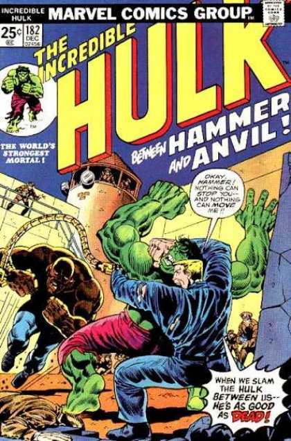
This issue uses a bit of the same perspective and angle we saw on 171. Notice how the prison is a bit distorted to add to the perspective (and echo the lines of the logo.)
189 - None So Blind
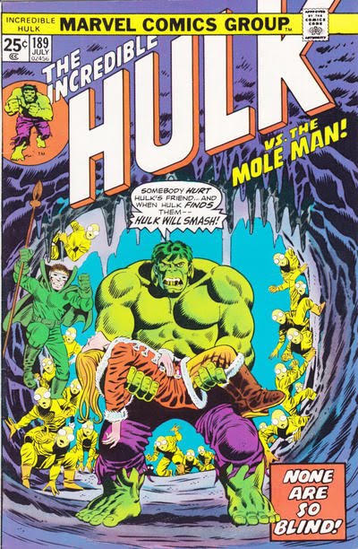
Great use of framing here.
And finally, probably the most remembered (and homaged) Hulk cover from this era.
181 - And Now, The Wolverine!
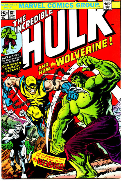
The curious thing about this issue is Wolverine only appears in just a few panels is this issue which was odd after making such a big deal of him on the
cover.
I hope you enjoyed seeing those even if you aren't as enamored with the Trimpe style as I am!
- Jim
No comments:
Post a Comment