Strangely enough, not many reviewers mentioned those. Heck on comicsbulletin.com, the closest we got a mention of the NEW costumes was one of the reviewers saying:
“The last few pages see Green Lantern humbled and Superman introduced. I'm sure other reviewers will have things to say about Superman's new and ugly costume, so I'll just say: gawd, it's effing hideous.”
But strangely enough, none of the other reviewers even mentioned the new costumes. Many posters were vocal about not liking the new costumes, but not many reviewers even mentioned them. Not even to try and defend them. Although they had a tough enough time trying to justify how it was okay for JL#1 to be “underwhelming”, So maybe they did not want to stretch it by trying to defend their armoured long underwear as well. ;)
And that is the first problem with some of them new designs right there. For example for Superman, without the red pants, damn how it looks even more like long underwear.
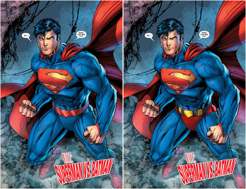
And in this case, like long armoured underwear. But it was decided that having red shorts was too silly (as if the new designs don’t look silly), So the shorts HAD to go. Although, notice how Superman still has shorts, They are simply coloured the same as the rest of his long underwear. And why does he even NEED armour?? He’s the goddamn Superman!! And will he wear it under his street clothes?? So many questions. ;)
But other than pretty much all the new costumes being some sort of weird armours with a lot of useless superfluous lines, the problem with them new designs seems to stem from Jim Lee. (yes I know that apparently he did not do all the design work himself, but he was the lead designer, whatever the other designers did, they were following his lead)
I like Jim Lee’s artwork. Heck I bought his Wolverine/Punisher prints many winters ago when not many seemed to care about his work.
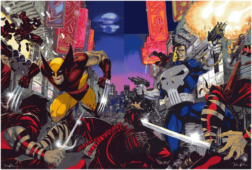
But when it comes to designing costumes, he is the last person on Earth you want to ask to.
Heck just looking at his dog collared Green Lantern design should be self-explanatory.
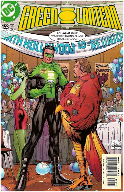
But let’s look deeper than that. The biggest problem with Jim Lee’s design is that often, the design looks good when drawn by Jim Lee, But looks like crap when anyone else is drawing it. There are many reasons behind that.
I don’t know if you guys remember?? A few winters ago, in one of my blogs I mentioned how in order to tell if a design was strong or not, an easy way to do that was to draw the character in a neutral pose. That way you can look at the design itself and not let the pose distract you from the design. And that sometimes, an artist would try to save a poor design by putting the character in a dynamic pose to distract the eye into looking at the strong pose, and not seeing the weak design. That is in part what Jim Lee does.
When you look at a Jim Lee drawing, often the artwork is strong enough, that any weakness there might be in the design is pretty much ignored by the untrained eye. Also, when Jim Lee designs a character, it is closely linked to the way he draws. The way his design is structured is linked with the way that he does structure his characters as he draws. So once another artist, that does NOT structure his characters in a similar way, tries to draw a Jim Lee design, It falls apart. For a Jim Lee design to work, You almost HAVE to draw like Jim Lee. And sadly, Not many can pull it off.
Also, Jim Lee adds a thousand unnecessary lines to his designs, Again that is linked with how he adds a lot of unnecessary lines in his artwork itself. If you cannot figure out why or how Jim Lee adds all them unnecessary lines to his artwork, You will have a tough time pulling it off yourself. So when an artist that does not use much lines tries to draw a Jim Lee design, it usually is a disaster. When Jim Lee takes a Kirby design and adds a thousand lines to it, the design is strong enough that it still works. But when you take a Jim Lee design and try to draw it without adding a thousand lines to it, It falls apart.
I won’t complain about the designs being skin tight armour. I did not mind when Iron-Man had some skin tight armour, heck I miss his skin tight armour, so I won’t start complaining about it now. But, does Superman really NEED armour?? I know that they are trying to justify it saying that it is some ancient Kryptonian armour, but the truth is, that is how it was designed, and the Kryptonian thing is just an excuse to explain the armoured look for Superman. And if it is an ancient Kryptonian armour, Why does it match with Batman’s armour?? The very first time that Batman and Superman meet, and they NEVER met before, but they both have matching armours?? Does Batman wears an ancient Kryptonian armour as well??
Or why does it have the same collar as the rest of the JL costumes?? Again they never met before. The answer is simple, because they all were designed by the same guy, Jim Lee. And in some cases, it is difficult not to think that it is just Jim Lee trying to put his mark on every single DCnU characters. Look at Green Lantern for example. Thank god for his new design, he is well protected now, he has shoulder pads/armours now. Why?? Just so Jim Lee could put his mark on him. Heck I am surprise that he did not give him some kneepads as well. If all he could add to the Green Lantern design was some useless shoulder pads and some “V” collar, he should have left the design alone.
And for Batman, did they not redesign Batman like 6 months ago with “The return of Bruce Wayne”?? Did he really need a new design, again??... so soon?? I guess someone at DC (Jim Lee???) did not like the yellow Bat oval and HAD to get rid of it?? So they used up this opportunity??
And I won’t go into details about how BAD the new Cyborg design is.
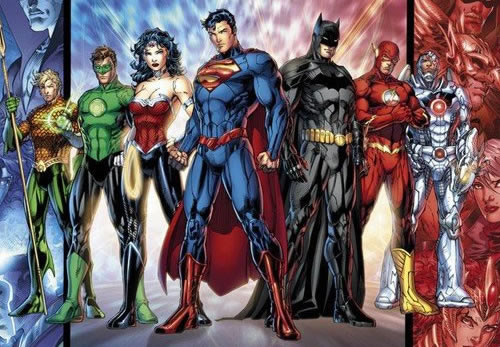
It will take me about a 1000 pages to try and properly explain it, so I will just settle with saying, Damn it is a bad design. So one of the biggest challenge for the DCnU will be to see how many artists can make the new Jim Lee designs look good.
Seeing how the DCnU is a hit, we at the FBU HQ not being complete fools decided to commission Jim Lee to redesign our characters. But since he was not available, we tried to get his Earth “Replacement Killers” counterpart John Lee, but failed to locate the Flash to help us travel to that universe.
So we had to settle for some Mystery Woman who rebooted our FBU into the NEW FBnU as I was running around really fast (at least really fast compared to a turtle) almost giving myself a heart attack in the process. ;) And here is the result:
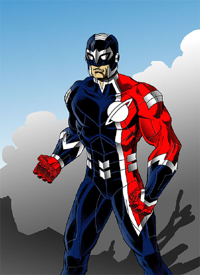
So From now on, Saturn Knight will proudly wear his brand new Uranian Battle Armour, and our comic will be available for digital download on the same day they are released. Go download our comics and buy our new Saturn Knight action figure in his new armour. ;)
But seriously, Jim (probably being tired of hearing me bitching and complaining about all them changes) asked me the $50,000 question:
“I'm curious - how would you have redesigned the Superman costume if Dan Didio came up to you and put a gun to your head (or a million dollars in your lap!)”
Since this Blog is already wayyyy tooo long already, this will have to wait for another time. ;)
Until next time.
-Pierre

18 comments:
I actually kinda like the new Saturn Knight suit. ;)
Here's an interesting aspect to the costume redesign...it means money for the designers!
In 1984, DC had Jack Kirby redesign the Fourth World characters for the Super Powers comics and toy lines.
The reason that was done was to enable Jack to make royalties off the use of the characters in licensing which he otherwise wouldn't have received under the contract he had created them under in the early 1970s. (He was getting a reprint fee, but no merchandising, reuse in new stories, or adaptation royalties.)
The redesigned characters were considered "new" versions, and thus eligible for the then-recently-revised creator contracts that brought people like Brian Bolland and Frank Miller to do graphic novel projects.
It was a gutsy move by Paul Levitz, Joe Orlando, and Jeanette Kahn to create a workaround to help The King after not being allowed by the Warner lawyers to simply modify the existing contract Kirby had.
So, do the new costume creators (Jim Lee, Cully Hammer, etc.)now receive royalties for any merchandising/licensing use of the "new" versions of Superman,Batman, Wonder Woman, etc?
Or do the Siegel, Shuster, Bob Kane, and Molton estates still get their cuts?
(we already know Bill Finger, Gil Kane, Gardner Fox, Carmine Infantino et al [or their estates] ain't getting anything...)
Ha Ha Ha Ha! first comment and no mention of the DC costumes! Did Trey not read your article?
I like the absence of the shorts. It was a good decision and a long time coming. Now if they'd actually admit men have, uh, packages, it would help. Now, I'm not gay, but i like my art more realistic. It just looks odd to see all these castrated men.
The collars and shirt cuffs suck. Armor and extra lines suck. And wouldn't you think that with the chance to totally reboot these characters, they'd finally give Superman a mask? The glasses thing has been laughed at so long, you'd think it was time.
Enjoyed hearing from you, Pierre. You write well.
I think it's obvious what's going on with Superman and Batman. They're going to start double-dating with Apollo and Midnighter.
Trey; Sorry buddy... enjoy it while you can... cause I doubt you will ever see that costume again. ;)
The Uranian government lodged a complain to the Cross-Time Cops who confiscated SK's NEW Uranian Armor.
Sorry. ;)
Britt; It was very big of Paul Levitz. Talk about a guy with class.
It makes you wish that someone at Marvel would have had the decency to do something similar. :(
But seeing how Jim Lee seems to be a shrewd businessman.... I can see why he wants to be able to claim that he redesigned as many DCnU characters as possible.... if it means some royalties in his pocket in the long run.
I wonder if the DCnU Superman as written by Grant Morrison will go after Jim Lee in an upcoming issue of Action Comics?? ;)
nude007; (Damn I feel dirty just writing that ;) )Thanks.
Did you hack into my computer??? Because I am adressing the lack of adding as mask to the new Superman in an upcoming blog.
Stay tuned.
As for Trey... of course he does not read the Blog... he just looks at the pretty pictures. ;) (Sorry Trey) :O
Joe; Good one.
Although... of course at some point.... you will have the inevitable Superman/Batman VS Apollo/Midnighter comic.
It is just a matter of time.
Although I doubt that it will be a double date.... but you never know. ;)
I might be ok with Superman starting out in the super-hobo costume if his eventual upgrade wasn't going to be a hand-me-down from Spartan's closet.
As for the trunks, if someone put a gun to my head and threatened to blow up the world then what I might do is have simply left everything else about the costume alone but make the classic belt red instead of yellow, keep the yellow buckle. That way the column of blue that is his body suit is still broken up with red but without using jagged edges that don't it the character or otherwise hacking up lines on his costume.
Also, Saturn Knight with seams just makes me sad.
The thing that bothers me most is the cape. It looks inserted into his collarbone. In the previous costume it made sense, since that's where the neckline was. But now, with the collar, it looks out of place.
Excellent points Matt & Reno. I was going to say they should have kept at least the yellow buckle myself, but forgot.
I kinda liked the version of supes cape where it tied into the symbol on both sides. I do like that they made the symbol smaller like it used to be.
I still say that within a year there won't be a DC comics if this is what they are going to.(not just costumes, but story and focus)
Oh, I also forgot to mention that I agree that Cyborg's costume is ridiculous. Maybe they shoulda made Cyborg be able to switch his consciousness with a total robot body kinda like Noman. They could make him able to switch places with it too so it ends up he's kinda like Colossus, but a true mechanical being. Then he could have a "secret ID" and interact more normally.
Anybody reminded of the Cracked comic article about "how to draw Superhero Comics"? It had Liefeldian character designs of men with constipated expressions, because they were too busy fighting crime to go to the bathroom, and women with long hair and similar body types in sexy positions. The last page had S-heroes doing mundane tasks such as taking out a library book and grocery shopping in action poses.
If anybody wants, I could post them up if they can't be found elsewhere.
Matt; Stick around.... I will post various Superman design in a future blog.
Yes the useless seems are... puzzling to say the least. And notice that even as a joke.... I did not have the strength to give Saturn Knight some kneepads.
Reno; Yeah... the cape makes even less sense with this new design.
Whoever gave their seal of approuval for this clearly did not think things through.
nude007; Short term... it seems that DC will make lots of money.
But next year??... or long term???
Who knows.
We will have to wait and see.
DeBT; Never saw that Cracked article you mentioned.
But you got me curious about it.
If you would be so kind as to post it... it would be much appreciated.
Thanks.
Sorry for the delay. Here's the Cracked article I was talking about.
http://sundaycomicsdebt.blogspot.com/2011/09/how-to-draw-s-hero-comics.html
DeBT; Don't worry about it. There was no rush.
Thanks... I really got a kick reading them "How To" pages.
Much appreciated.
Post a Comment