
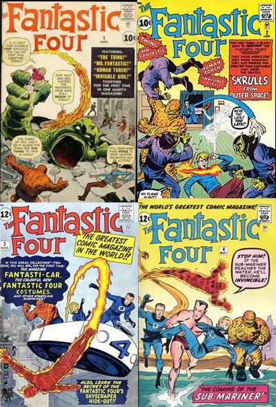
First here are the first 12 Fantastic Four Covers
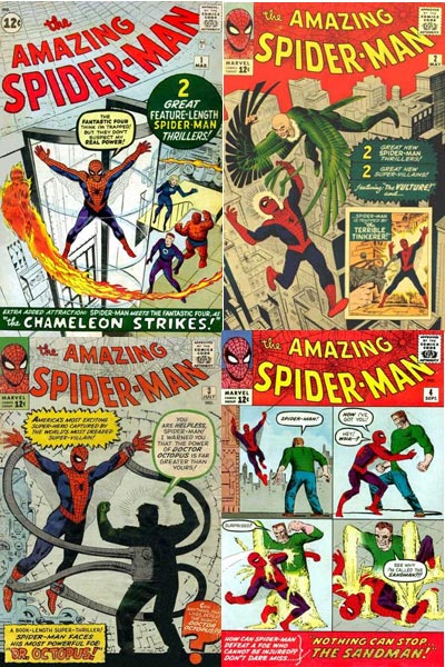
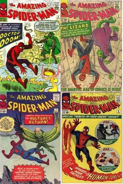
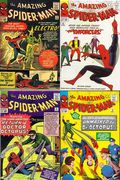
Now let's look at the first 12 issues of Amazing Spider-Man
Thoughts:
The first thing that jumps out at me is just how many of Ditko's early covers convey a sense of peril vs Kirby's. Spider-man is often at the mercy of his foe on the covers. By my count, there are 10 issues where Spider-man is imperiled vs only four of the early FF covers. (Five if you count the Puppet Master cover)
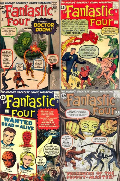
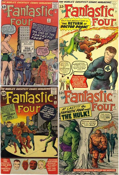
Early Kirby also tends to lean towards a flatter perspective than early Ditko. With the rare exception of FF 2 (the Skrulls cover) Kirby doesn't play around with perspective very much. Contrast that with Ditko does on Spider-Man 5, 10 and 12.
There is also a greater sense of movement on the Ditko covers. Kirby's covers often feel like the Calm Before the Storm. On three of them, the Fantastic Four are either just standing or walking.
Ditko also played more with layout than Kirby, notable examples being the 4 panel layout of issue 4 with Sandman, the 2 panel layout on issue 9 with Electro and the circle insets on issue 8.
Kirby's early covers also tend to have a more static composition. Check out how the figures are boxed in on these covers.
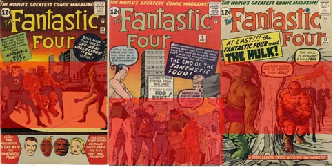
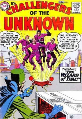
I think Kirby's early FF covers suffer because he may have had a hard time wrapping his mind around how different the characters were from the Challengers of the Unknown. Many of the first year FF covers look like they would harken back to the format that served him so well with that series.
Whereas Ditko instinctively knew how to have fun with Doc Ock's metal tentacles, curving them around the space or directing focus, it would be years before we saw the same kinetic design used with Reed Richards. During the first year, when Reed was stretching on the covers, it often comes across as an artistic afterthought. As the Series continued, Kirby would be more inclined to play with composition and movement.

Early Kirby would sometimes use the Human Torch's flame trail to convey movement, but it was never incorporated very organically in the design. Conversely, check out how Ditko uses the flame trail to add a rippling effect on the cover of Spider-man 1:
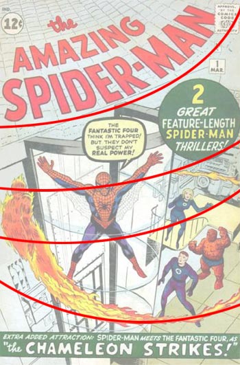
UPDATE: I was informed after I put this post up by commenter Kid, that Kirby actually drew this issue and Ditko inked it. The rippling effect may have just been a happy accident in this case as Ditko embellished Kirby's original art and then whoever added the cover title followed suit.
Ditko uses curved lines a number of times on his early issues. (1, 3, 5, 6) As a result, they do help give his covers a nicer sense of rhythm (or gestalt if you prefer.)
I started this article referring back to a theory I had, so I'll leave on the same note. I think that as the years played out, Kirby seemed to grow more than Ditko, partly due I suspect to the amount of work demanded from him. I'll see if that theory pans out in a future post.
- Jim


