Saturday, August 25, 2012

Tips for Artists from a Guy Who Can't Draw

For the past couple of weeks, I've been reading and reviewing art samples from various artists who are applying to illustrate a book cover I am working on. (Not a comics project) This is an arduous process that usually leaves me feeling like this:


I have seen a LOT of good art portfolios by some incredible artists, but as usual, there are many new artists that make the reviewing process difficult. So today, I'd like to post a few tips to any artists that will help them get more art jobs.

Get a website for your portfolio
If you can't build your own, there are quite a number of free services (Flickr, DeviantArt, ComicArtFans) that you can use. It was at ComicArtFans that I saw Pierre Villeneuve art for the first time.

The best thing about such sites is that they give you a way to display your art with nice thumbnail previews. Like Pierre is doing here:

What is good about this is it allows a prospective editor or customer to see a lot of samples all at the same time. Then we can zero in on the one we like the best very quickly. (I really like this page by Pierre btw)


The other thing that is cool about ComicArtFans is that it gives you a nice way to group your art into categories. (I don't know if DeviantArt can do this or not)

Keep Attachments Small
Art samples in an email should never be bigger than 5 megs. I received one sample that was 24 megs.


I didn't even know Gmail could handle files that big. As it is, an editor may be reviewing your portfolio over a slow connection like a 3G network on their iPad or phone. They will not be able to easily view huge files. Make it easier on them and keep the file size under 500K if at all possible.

Don't send your art in a PDF
Not everyone even has Adobe PDF reader on their computer, so you don't want to lose a possible sale that way. Plus, there are some people who just hate the PDF format out of hand (as this graphic that I found floating around the internet will testify.)
Include references if you have them
If you've worked on other projects in the past, mention them. It shows a certain level of professionalism that gives people confidence in working with you.

Double check your email
This sounds like a no brainer, but I received several emails with no links to a portfolio site and no attached art samples. Just a sentence saying, "Hey. I saw your ad. I am interested." I don't know if these people forgot to send me a link or samples OR if they intended for me to ask them to send me more information. The sad truth is, I've only got a limited amount of time to review art, so their emails lose out to the people who sent me what I needed the first time.

Don't worry about your English
I've worked with people from all across the globe. It's nice when an artist can communicate in English, but I don't worry about it too much if they can't. We will find a way to communicate. :)

 Have a great day!

- Jim


Saturday, August 18, 2012

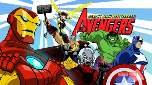
Pierre Reviews The Avengers: Earth's Mightiest Heroes

Today FBU Co-Creator and Animator Extraordinaire Pierre makes a rare appearance in order to give us a his review of the Avengers cartoon on Disney XD. - Jim

And there came a day when Earth's mightiest heroes found themselves united against a common threat. On that day, the Avengers were born.... to fight the foes no single super-hero could withstand.

That small paragraph sums up perfectly who the Avengers are. When I first saw some clips for "Earth's Mightiest Heroes... The Avengers".... all I could think of was of how poor the animation was.


There are many reasons behind that. The style used was not very streamlined for animation... and the character designs are wayyyy too busy to be animated easily. It must have been an Herculean task to do the animation for that show. Sadly... the producers shot themselves in the foot from day one with some poor decisions that made the animator's job next to impossible.

So I had no interest to watch the show. But I caught the first episode one night and decided to watch it. And despite all the flaws, despite all the poor decisions, I liked it. The broadcasters did a very smart move, the first episode they aired was supposed to be the sixth episode in the series. The first episode from what I understand was meant to feature only Iron-man. Then the second one was meant for Thor. Then Hulk. Then Cap. And finally after 5 episodes more or less of solo adventures, we would get the Avengers. So we would have had to wait 6 episodes before getting to see Earth's mightiest heroes.

But that meant risking disappointing those who wanted to see the Avengers. Not the solo adventures of Iron-man, or the solo adventures of Thor. If you want to do that, make a solo Iron-man series, or a solo Thor series.
But then again, I can pretty much tell you what the producers were thinking. At the time they made the Avengers cartoon, the Iron-man movie had been a hit (not sure if we had Iron-man 2 yet at that point). So the Iron-man movie being a hit, they figured that starting the Avengers cartoon with a solo episode starring Iron-man would have meant instant success. Yes producers can be funny that way sometimes.

 But luckily the Broadcasters had a much better idea. The broadcasters did a very smart thing and started with a bang. They started with an episode starring all the Avengers, or at least most of them and then after that they gave us the episodes that focused on the individual members.

You see, once the broadcasters buy a show, once they have the episodes, they can pretty much do what they want with them. They can decide in which order the episodes play on TV. Heck they can even decide to put the episodes on a shelf in some warehouse and NEVER play them on TV. They paid for the episodes, so they can pretty much do as they like with the show. In can be more complicated then that in some cases, but to keep things simple, the Broadcaster can pretty much do what they want with the show.

And in the case of the Avengers they have decided to start the series with the sixth episode that was already showing most of the team, and I have to agree with the Broadcasters. I believe that it was a mistake not to start with most of the Avengers roster in the first episode.

How do I know in what order the episodes were meant to be played as?? The director of Walter & Tandoori gave me the first season of Earth's Mightiest Heroes, The Avengers on Blu-Ray. So that is how I know the original intent of the producers.

Of course, I could be mistaken and it could all be in my head only. But I have been working in animation for quite some time now, and I pretty much know how producers and broadcasters think by now. So I like to believe that I can make a lot more than just a guess, but a HECK of an educated guess by now. But you never know for certain, I could be mistaken.
Oh well.

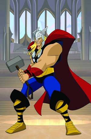
So if the animation is so bad, why did I like this show?? Because it did feature a more classic version of the Avengers then the movie did.  In the cartoon version, Hawkeye is the Hawkeye that I love. Iron-man seems more like the movie version, but Thor feels like Thor. Cap looks and act like Cap. And heck we get a lot of classic Avengers villains.

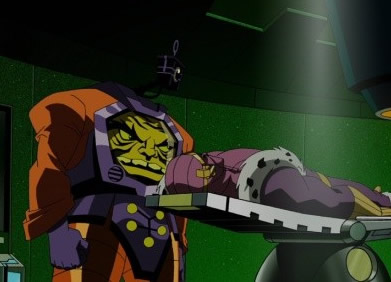
Any show that gives us the Kirby version of Arnim Zola is okay in my book. ;)


So most of the characters look and act like the comic version used to. Some elements from the movies did creep into the show like the Iron-man/Tony Stark from the movies, or the black Nick Fury. But it is mostly minor stuff. So the fun characters and engaging stories quickly made me forget the poor animation. I would not suggest this show to everyone. I would suggest this show to any classic Avengers fan.

Although I did try to suggest the show to some guys at the studio who love silver age comics, but they could not get over the poor animation. Guess they were not as forgiving as me. ;)

Sadly it seems that the second season of the series will be its last. Disney plans to replace it with a new Avengers show from what I hear. No surprise there, that was to be expected. I guess we will have to wait and see if the new show will be an improvement or not.

We will see.

Until next time.

- Pierre

Monday, August 13, 2012

Farewell Joe Kubert

I had a new post by Pierre ready to go today when I found out that Joe Kubert passed away over the weekend.

While he never worked much on the superhero comics I loved so much as a kid, his Tarzan made quite an impression on me. (click to see full size)


Where I first encountered his work was with the 100 Page Super Spectaculars (which I tried in vain to collect, but my newsstand wasn't as interested in them as I was.) I did manage to get my hands on this one at the newsstand.


And this one later at a Heroescon (back when Heroescon was held inside of Eastland Mall for those of you who can remember such a time.)


As a kid, Kubert's style struck me as extremely realistic - not in a photo realism way, but in ability to capture motion. Even simple pages with very little action looked realer.


When I was in college, and heard about the Joe Kubert school for comic artists, it made total sense to me. Who else would be better suited for such a role?

He was definitely the master of the form.

- Jim


Sunday, August 5, 2012

How is your comic shop doing?

I am at the beach this weekend, So today's post is going to be a little light. - Jim

Reading this news item at the ComicsBeat.com, It made me think about Comic book sales at my own comic shop.

A Growing Sense of Concern Over Marvel’s Sales - http://pulse.me/s/bTQgh

For the past couple of months I've noticed my comic shop orders less titles and often running out of comics before the end of Wednesday. In many cases I have also noticed the shop misjudged how many to issues to order (the recent wedding issue of x men was significantly over ordered.) There was also a recent round of layoffs at the shop with many long time employees being shown the door. All that adds up to a business in serious trouble.

This makes me wonder:
Are the problems at my shop indicative of widespread problems throughout the industry?

So how is the place you buy your comics doing?

Sunday, July 29, 2012

Kirby Vs Ditko: Year One

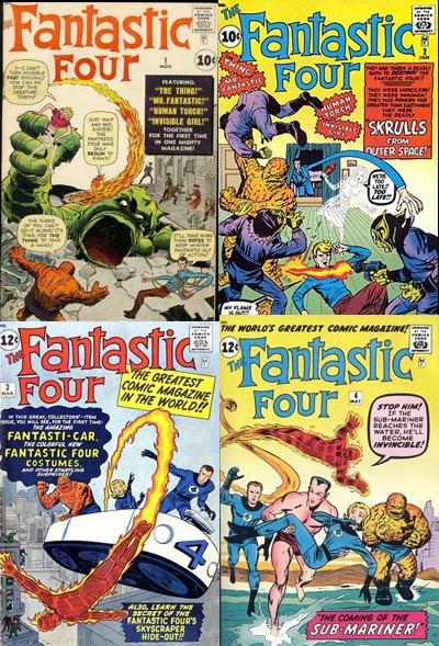
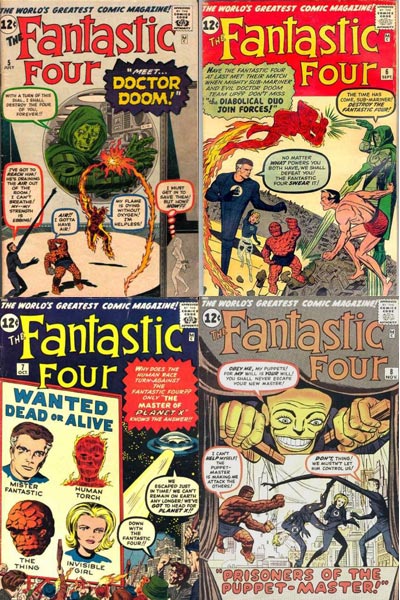
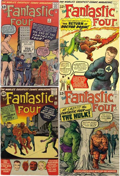
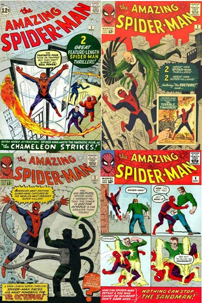
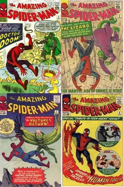
A while back in response to my article on Ditko's Design Sense, a comment on that post got me wondering about Kirby's early Marvel work versus Ditko's early Marvel work. My first thought was that Ditko's early Spider-man covers were better than Kirby's early Fantastic Four covers, but I've never really examined them together. See what you think.

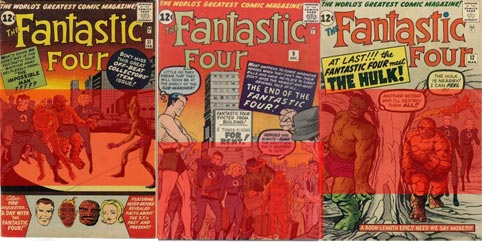
First here are the first 12 Fantastic Four Covers


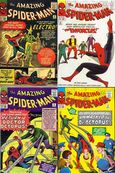
Now let's look at the first 12 issues of Amazing Spider-Man


Thoughts:
The first thing that jumps out at me is just how many of Ditko's early covers convey a sense of peril vs Kirby's. Spider-man is often at the mercy of his foe on the covers. By my count, there are 10 issues where Spider-man is imperiled vs only four of the early FF covers. (Five if you count the Puppet Master cover)

Early Kirby also tends to lean towards a flatter perspective than early Ditko. With the rare exception of FF 2 (the Skrulls cover) Kirby doesn't play around with perspective very much. Contrast that with Ditko does on Spider-Man 5, 10 and 12.

There is also a greater sense of movement on the Ditko covers. Kirby's covers often feel like the Calm Before the Storm. On three of them, the Fantastic Four are either just standing or walking.

Ditko also played more with layout than Kirby, notable examples being the 4 panel layout of issue 4 with Sandman, the 2 panel layout on issue 9 with Electro and the circle insets on issue 8.

Kirby's early covers also tend to have a more static composition. Check out how the figures are boxed in on these covers.


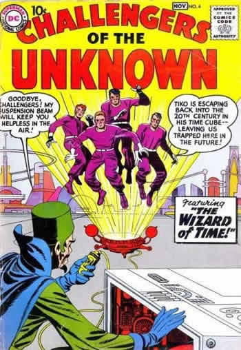
I think Kirby's early FF covers suffer because he may have had a hard time wrapping his mind around how different the characters were from the Challengers of the Unknown. Many of the first year FF covers look like they would harken back to the format that served him so well with that series.


Whereas Ditko instinctively knew how to have fun with Doc Ock's metal tentacles, curving them around the space or directing focus, it would be years before we saw the same kinetic design used with Reed Richards. During the first year, when Reed was stretching on the covers, it often comes across as an artistic afterthought. As the Series continued, Kirby would be more inclined to play with composition and movement.


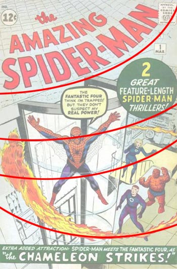
Early Kirby would sometimes use the Human Torch's flame trail to convey movement, but it was never incorporated very organically in the design. Conversely, check out how Ditko uses the flame trail to add a rippling effect on the cover of Spider-man 1:


UPDATE: I was informed after I put this post up by commenter Kid, that Kirby actually drew this issue and Ditko inked it. The rippling effect may have just been a happy accident in this case as Ditko embellished Kirby's original art and then whoever added the cover title followed suit.

Ditko uses curved lines a number of times on his early issues. (1, 3, 5, 6) As a result, they do help give his covers a nicer sense of rhythm (or gestalt if you prefer.)

I started this article referring back to a theory I had, so I'll leave on the same note. I think that as the years played out, Kirby seemed to grow more than Ditko, partly due I suspect to the amount of work demanded from him. I'll see if that theory pans out in a future post.

- Jim

Monday, July 23, 2012

Let's Try Some Indy Comics

For the past several weeks, I've been sampling different independent comics over at Comixology. I've been impressed with how Comixology seems to have stepped up their game with promoting independent comics in the application, giving quite a number of them a prime slot on their home screen masthead. See below the spot for Fantagraphics and Abrams as an example.

The first comic I tried was The Tower Chronicles, a free 12 page preview written by Matt Wagner and illustrated by Simon Bisley. I've always liked Matt Wagner, so I figured it would be a sure hit. I guess the cover should have tipped off more.

If the cover gives you a bit of 90's extreame deja-vu, then you aren't alone. Shoulder Pads? Check. Pouches on belt? Check. Buckles everywhere? Check.

The insides didn't do a lot to change that impression. The art reminded me of the lackluster storytelling that was so rampant during the early Image years.

The story isn't much better. It involves a plot twist you see coming by the second panel. After 12 pages we don't know much more about the main character other than he's a bad ass. To call the story servicable is about as nice as I can go. If you are expecting the Matt Wagner of Mage, Grendel or Sandman Mystery Theater, you are going to be a bit disappointed.

Ratings:
Art: 5/10
Story: 4/10


Next was a comic called Edison Rex from Monkeybrain comics by writer (and publisher) Chris Roberson and drawn by Dennis Culver. Again, the cover gives us some idea of what we are getting into here.

If you guessed a sort of animated feeling story with a bit of an Invincible vibe, you would be correct. With that said, it was enjoyable with a few clever touches in the story. The title character is a Lex Luthor analogue played a bit more reserved. This first issue had a few homages to old Silver Age Superman comics (as you might imagine) which I enjoyed, so I'll be interested to see what Roberson does as the story moves forward.

There was a bit of flagrant recycling going on...(check out Edison's head in these panels)

But there were also some nicer panels like this one below:

It felt a bit, both storywise and artwise, like an episode of Venture Bros played totally straight. Which is actually a very awesome thing. I can also see this comic getting compared to Tom Strong as time goes on. All and all, a pretty good start for a new comic.

Ratings:
Art: 7/10
Story: 7/10

Perhaps the best discovery I've made from trying independent titles was the Lookouts from Penny Arcade by Ben McCool and Rob Mommaerts

The Lookouts are a sort of Rangers in training for a fantasy woods called the Eyrewood Forest. They receive badges for passing various tests (defeating a Troll, healing a forest animal, guarding a human settlement) which is a sort of interesting story gimmick. There is also a suggestion of deeper intrigues between their leader, the grim one eyed Samson and village elders.

The real appeal to me on this series though is the art and coloring. Check out these pages:


And this panel, which to me has a certain Rankin/Bass feel to it.


My only complaint with this comic is that the Lookouts themselves don't do much in it. The story is pretty much all set up with about 4 pages spent on some characters who we may never see again in the series (as it is suggested.) I think a page could have been sacrificed to give us at least a flashback scene wherein we see the Lookouts doing something that gives an idea of what they are capable of.

Ratings:
Art: 9/10
Story: 7/10

Overall, trying these new comics was an enjoyable experience which resulted in me discovering one I really liked, so I encourage everyone out there to do the same. Either try one of the ones I mentioned or something completely different. I think us old school readers tend to rely on old favorites to entertain us, and then complain when the old standbys fail to do their job. It might be better to look elsewhere for our fix. If you already have discovered a new comic you really like, feel free to tell me about it in the comment section.

- Jim

Monday, July 16, 2012

Moving Comics

I postponed today's post a bit so that I could post this update I got this mornging from Flashback Co-creator, Pierre Villeneuve!. - Jim

Hi guys, a question pops up  once in a while.... "What is Pierre doing?". As much as I love making comics.... the lion's share of my income comes from my working in animation. Until very recently... I was working on a series called Walter & Tandoori.


But I just moved onto another project called Ben's City.


Remember how Jim had mentioned about 2 years ago how I had received a promotion??? The promotion at the time was to be the Storyboard Supervisor on the first season of Ben's City. I had been doing storyboards corrections for a few seasons of Arthur and for a season for a show called Caillou.... and then I was offered the job of Storyboard Supervisor.

I had lots of fun working on that first season of Ben's City.... so when I was offered to work on a second season of that show.... I could not say no. Although I was torn.... I had fun working on Walter & Tandoori.... but I was dying to be Storyboard Supervisor once more. I loved that job. It's a lot of work. There are always tons of problems to solve. And you are constantly making decisions for the production.

But that job gives quite an adrenalin rush that is more addictive then crack. ;) Guess I was more then due for my next "hit". ;) Although I was offered to supervise the storyboards on a feature film.... I had to pass up on that one. The timing was not right for me to switch project then. I had to take care of some personal stuff (like finding a new apartment for example)... so I would not have been able to focus as much as I should have on a job such as a Storyboard Supervisor at the time. Also I was not sure who we could get to replace me on Walter.

My little heart was torn apart at the time because it seemed like a really nice project.... but I liked working on "Walter" and the timing was wrong. Also some of the people on "Walter" were more then colleagues... through the years of crossing paths in the same animation studios... many became good friends.

You have to understand that on some productions... we will work 40hrs, 60 hrs, heck sometimes 80hrs per week together. We will often spend more time together then we will with our own families. Heck sometimes we will spend more time together then some will spend with their boyfriends or with their wives. So leaving Walter meant also leaving some of my friends behind. Which is always sad.


But I got to see some of my other friends on Ben's City that I had not seen in a while. And odds are.... I will see my friends from "Walter" in another studio or on another production before long. We may even plan some sort of get together once in a while. We shall see. But it won't be the same as working together every day. As for finding a new apartment... I finally found something that will suit my needs. But I had to move just as I was starting on my new project. So it was a bumpy ride to get started as I was packing/moving/unpacking.

Although the moving part is now behind me... I have still about half a dozen boxes left to unpack. And once I will be done unpacking... I will still have the "fun" of sorting all of my comics. I had 5 bookshelves of comics. I am saying "had" because we broke one bookshelf while moving. And I have decided not to get a new bookshelf. Moving 5 bookshelves of comics is not fun.... not fun at all. So I used my broken bookshelf as an opportunity to trim down my comic collection a bit. I had already trimmed some of the fat before the move... but not enough. I had gotten rid of some comics that I had already replaced in digital format.... but somehow that I still kept in print as well.

But now with one bookshelf missing.... I will trim the fat one step further and get rid of those comics that I NEVER read again. I have some comics like Preacher or Sandman that I read once.... and although I liked them series when I read them at the time..... I have never felt the need.... the urge to read them once more. I have flipped through them quickly once in a while.... but as for reading them a second time??? No. Never.


These are comics that I am glad that I read them.... but that after reading them once...  have no intention of ever reading them ever again. So those will be the next to go. I have read the Dark Phoenix Saga, or the Search for Galactus, or the Demon in a bottle, or Avengers Forever, or the Korvak Saga, or other comics that I fail to mention way too many time. Loved them comics. Loved every second spent reading them.


Although... odds are.... At some point in time.... I will get rid of all my floppies/singles issues and I might only keep my Omnibi/Absolute Editions.

We shall see.
Until next time.
- Pierre

LinkWithin

Related Posts with Thumbnails