Today Pierre gives us a review of the Batman Under the Red Hood animated movie.
I can’t say that I am a fan of Judd Winick. I don’t hate him either; I just did not read much of what he wrote.
I read part of his Green Arrow run, an issue or two of his Outsiders, and probably a couple of other comics that I can’t recall right now. And I did NOT read his Batman comics where he brought back Jason Todd. But as I mentioned in a previous Blog, I am a sucker for them direct to DVD movies that DC has been producing.
So when I saw the Batman: Under the Red Hood Blu-Ray, I figured that I would give it a chance. And it was not bad, but it was not very memorable either. Heck I had to watch it 3 times before writing this review because each time I could barely remember what was happening in this film.
Nothing really stands out; nothing is really memorable about this. The most memorable scenes have to be the scenes with young Robin/Jason Todd. The scenes themselves were fun. It was fun to see the light-hearted version of the character.
And the battle vs Amazo was a fun scene as well.
It was a fun action sequence that also gave Nightwing/Dick Grayson some screen time.
On a side note… as for the return of Jason Todd, I can’t help but feel that DC dropped the ball big time on that one. Once they gave us the “fake” return of Jason Todd in Hush, It pretty much took away any impact that this “real” return could ever possibly have.
If it had been done in Hush as planned, It would have been a cool return. But this time it felt like, “We chickened out the first time, let’s try again.” And it was not cool.
But back to the film - The design work usually was okay… although whatever bad design I thought there was… it was more a matter of personal preference then actually bad design. I was not too crazy for the Joker design, but it has more to do with the fact that the definitive Joker to me is the Jim Aparo version of the character.
And the Joker in this film is too far from that to really work for me. It felt to me like they had cast Arnold Schwarzenegger in the role of the Joker as opposed to Heath Ledger. It felt like the wrong casting in my book.
The animation was competent. Nothing bad really stood out, but nothing to marvel at either.
The worst part probably was the integration of 3D/CGI elements in the 2D film. It did not clash as badly as the 3D in the Batman: Sub-Zero film, But it was not integrated as well as it should have been. So whenever there are some 3D elements like cars in a scene… I could not help but find it distracting, because it did not really match with the rest of the film. That is probably just me being picky. I would not be surprised if most people did not even notice this.
In the extra section… you get a few documentaries about Robin/the Death of Jason Todd that I always find fun to watch. I always get a kick of seeing the likes of Denny O’Neil, Len Wein, Dan Didio, etc, even if I don’t always agree with what they are saying.
The Jonah Hex short was fun to watch. I did not find it as strong as the Spectre one, but to be honest… none of the shorts made by DC so far come even close to matching with what they did in the Spectre short. Although if all you want is to watch the Jonah Hex short, Get the Superman/Shazam DVD instead.
So is this worth buying?? If you are a fan of Jason Todd, I would say, Yes.
But if you are NOT a fan of Jason Todd, especially if you are one of the thousands who called and paid 50 cents to get him killed in the first place, I doubt you will find much that will please you in this movie.
Until next time.
-Pierre
Friday, September 30, 2011
Wednesday, September 28, 2011
Flashback Five on Brave and the Bold 158
Matt brings us a new Flashback Five to show us five cool things about Brave and the Bold 158
Today's FB5 is itself is not a particularly Earth-shattering chapter for either the characters or for the Brave and The Bold series but it is an old favorite from my childhood. Much to my surprise looking back Wonder Woman was a rather frequent guest-star in the original Brave and The Bold. This particular issue would mark her last appearance in the series before it was eventually canceled in 1983. This issue stood out to me when going through the Brave and the Bold series for two reasons. One it was actually one of the earliest appearances of Wonder Woman I ever saw with the other one being an earlier issue of her own series where she fought Angle Man and the tabloid sized Superman vs. Wonder Woman special. Up to that point I mostly knew her from the Lynda Carter TV series. This issue was also the first time I ever saw artwork by the legendary Jim Aparo. So here we go with 5 things I liked about The Brave and The Bold #158 starring Batman and Wonder Woman!
1 - The cover. This cover really struck me as a kid. The expressions are great, and the overall effect leaves you wondering what could so inspire fear in our heroes.

Now in comics it is so common to have the cover simply be a somber pose or a painted pin-up but I think the strength of this cover is a case-in-point about why your cover should be reflective of the story inside. What are they afraid of? The cover makes you want to pick it up to find out. That's a covers job! Ideally and with few exceptions, every cover should be telling the reader why they should give enough of a damn to spend their money on it!
2 - Hero interaction. Bruce and Diana really feel like old friends with a genuine affection for each other.

It's subtle enough your mind could take it the romantic route or you can just take as two veteran heroes who have been through a lot of battles together who are friends and respect each other greatly. Going back to it now, it is such a nice change of pace from the constant stream of clashing egos and pre-teen level snark between heroes in modern comics. Batman is as much of a creature of the night as he needs to be without being required to be a miserable grimdark jerk.
3 - Jim Aparo artwork If Neal Adams defined (or perhaps refined) the most iconic look for Batman, Jim Aparo set it in stone.

Aparo's art is easily the strongest thing about the issue. Batman and Wonder Woman look excellent as does his take on them as Bruce Wayne and Diana Prince. His panel composition moves the story along well and his action scenes are packed with dynamic energy. Plus I just like the look of his figures in this. Aparo's Bruce Wayne is handsome but he has a certain angular quality to his features that makes him look readily distinct from Clark Kent despite being a square-jawed fellow with black hair.
4 - Flashback or Deja-Vu (oddly he seems to be referred to by both names in the comic) is a lame villain BUT at least he had an interesting weapon.

I don't mind having one shot or d-list villains around because they help contrast your Lex Luthors and Jokers to show why they are the heroes greatest adversaries. Plus think about a police officer. Not every criminal they encounter is a master criminal, gun wielding psycho, or even a capable thief. If every super villain that shows up is an all powerful bruiser or shadowy master manipulator it has less impact. However, given his basic gimmick I really have to wonder why they didn't just have Scarecrow be the villain of the issue or perhaps even having Johnathan Crane being Deja-Vu's supplier.
5 - James Bond vibe. I enjoy it when there are adventures for Batman that takes him out of his usual Gotham City environment so long as it's not happening all the time.

A vehicle like the Brave the Bold series is actually quite perfect that as is Batman being in the Justice League or having to battle Ras Al Ghul. Also given the level of wealth and influence Bruce Wayne has it makes sense that he would be involved in the kind of scenario depicted in the comics involving a co-operation between U.S. and French business interests.
The issue has some other problems. For example Deja Vu being able to sneak up on Batman and Wonder Woman *in a helicopter*.

Also as much as I enjoy Aparo's art on the book there doesn't seem to be a lot of thought actually put in to the design of Deja Vu. I think at the very least they could have gotten a decent low tier villain out of him was just a touch more work. As is though I still the think it was a fun read with some outstanding artwork and proof that you really don't need a big bloated multi-part crossover event or an excuse to get two heroes to be at each other's throats in order to make it feel to the reader like these characters exist together in the same world.
Have a great day!
- Matt
Today's FB5 is itself is not a particularly Earth-shattering chapter for either the characters or for the Brave and The Bold series but it is an old favorite from my childhood. Much to my surprise looking back Wonder Woman was a rather frequent guest-star in the original Brave and The Bold. This particular issue would mark her last appearance in the series before it was eventually canceled in 1983. This issue stood out to me when going through the Brave and the Bold series for two reasons. One it was actually one of the earliest appearances of Wonder Woman I ever saw with the other one being an earlier issue of her own series where she fought Angle Man and the tabloid sized Superman vs. Wonder Woman special. Up to that point I mostly knew her from the Lynda Carter TV series. This issue was also the first time I ever saw artwork by the legendary Jim Aparo. So here we go with 5 things I liked about The Brave and The Bold #158 starring Batman and Wonder Woman!
1 - The cover. This cover really struck me as a kid. The expressions are great, and the overall effect leaves you wondering what could so inspire fear in our heroes.

Now in comics it is so common to have the cover simply be a somber pose or a painted pin-up but I think the strength of this cover is a case-in-point about why your cover should be reflective of the story inside. What are they afraid of? The cover makes you want to pick it up to find out. That's a covers job! Ideally and with few exceptions, every cover should be telling the reader why they should give enough of a damn to spend their money on it!
2 - Hero interaction. Bruce and Diana really feel like old friends with a genuine affection for each other.

It's subtle enough your mind could take it the romantic route or you can just take as two veteran heroes who have been through a lot of battles together who are friends and respect each other greatly. Going back to it now, it is such a nice change of pace from the constant stream of clashing egos and pre-teen level snark between heroes in modern comics. Batman is as much of a creature of the night as he needs to be without being required to be a miserable grimdark jerk.
3 - Jim Aparo artwork If Neal Adams defined (or perhaps refined) the most iconic look for Batman, Jim Aparo set it in stone.

Aparo's art is easily the strongest thing about the issue. Batman and Wonder Woman look excellent as does his take on them as Bruce Wayne and Diana Prince. His panel composition moves the story along well and his action scenes are packed with dynamic energy. Plus I just like the look of his figures in this. Aparo's Bruce Wayne is handsome but he has a certain angular quality to his features that makes him look readily distinct from Clark Kent despite being a square-jawed fellow with black hair.
4 - Flashback or Deja-Vu (oddly he seems to be referred to by both names in the comic) is a lame villain BUT at least he had an interesting weapon.

I don't mind having one shot or d-list villains around because they help contrast your Lex Luthors and Jokers to show why they are the heroes greatest adversaries. Plus think about a police officer. Not every criminal they encounter is a master criminal, gun wielding psycho, or even a capable thief. If every super villain that shows up is an all powerful bruiser or shadowy master manipulator it has less impact. However, given his basic gimmick I really have to wonder why they didn't just have Scarecrow be the villain of the issue or perhaps even having Johnathan Crane being Deja-Vu's supplier.
5 - James Bond vibe. I enjoy it when there are adventures for Batman that takes him out of his usual Gotham City environment so long as it's not happening all the time.

A vehicle like the Brave the Bold series is actually quite perfect that as is Batman being in the Justice League or having to battle Ras Al Ghul. Also given the level of wealth and influence Bruce Wayne has it makes sense that he would be involved in the kind of scenario depicted in the comics involving a co-operation between U.S. and French business interests.
The issue has some other problems. For example Deja Vu being able to sneak up on Batman and Wonder Woman *in a helicopter*.

Also as much as I enjoy Aparo's art on the book there doesn't seem to be a lot of thought actually put in to the design of Deja Vu. I think at the very least they could have gotten a decent low tier villain out of him was just a touch more work. As is though I still the think it was a fun read with some outstanding artwork and proof that you really don't need a big bloated multi-part crossover event or an excuse to get two heroes to be at each other's throats in order to make it feel to the reader like these characters exist together in the same world.
Have a great day!
- Matt
Monday, September 26, 2011
Undressing the DC Relaunch
Question for the day: Why is it that ever comic in the DC Relaunch that features WOMAN in the title also features the main character half naked and/or getting dressed at some point? Observe:
Batwoman where Kathy Kane and Bette get dressed not once but twice.

Here's the second time they get dressed.

Wonder Woman, who outside of the scene below is presented pretty well. However, the viewpoint character (also seen below) runs around in her underwear for the entire comic.

And Catwoman which starts by giving us Selina Kyle in a red bra and sort of goes downhill from there.

Now, I don't think this is due to any wank-minded agenda at DC. The timing to pull all the titles together (which sounds rushed) would have made an orchestrated T&A cabal a little unfeasible. Odds are what we are seeing here is business as usual and it's just the unfortunate happenstance that every title in the DC Relaunch is now being cross examined en masse. Unfortunate, because it does seem like this aspect of the titles is getting more attention than DC would perhaps like.
With that said, Wonder Woman was a great read and is probably going to end up as one of the success stories of the DC Relaunch.
To end this, check out today's Free Comic featuring another popular female hero from the Golden Age, Mary Marvel (who somehow managed to keep her clothes on for decades.)
Mary Marvel 16

Enjoy!
- Jim
Batwoman where Kathy Kane and Bette get dressed not once but twice.

Here's the second time they get dressed.

Wonder Woman, who outside of the scene below is presented pretty well. However, the viewpoint character (also seen below) runs around in her underwear for the entire comic.

And Catwoman which starts by giving us Selina Kyle in a red bra and sort of goes downhill from there.

Now, I don't think this is due to any wank-minded agenda at DC. The timing to pull all the titles together (which sounds rushed) would have made an orchestrated T&A cabal a little unfeasible. Odds are what we are seeing here is business as usual and it's just the unfortunate happenstance that every title in the DC Relaunch is now being cross examined en masse. Unfortunate, because it does seem like this aspect of the titles is getting more attention than DC would perhaps like.
With that said, Wonder Woman was a great read and is probably going to end up as one of the success stories of the DC Relaunch.
To end this, check out today's Free Comic featuring another popular female hero from the Golden Age, Mary Marvel (who somehow managed to keep her clothes on for decades.)
Mary Marvel 16

Enjoy!
- Jim
Thursday, September 22, 2011
High Rez Reviews 3 | Nightwing #1
Today, Caine returns with another High Rez Review - this one of the new Nightwing!
LAST ISSUE.....
It all started on November 4th 2008. All of the major comic book news blogs reported the following:
According to the publisher, the February-shipping issues of Robin, Nightwing and Birds of Prey will be the final issues of the respective series.
As well as being the final issues, Robin #183, Nightwing #153 and Birds of Prey #127 will end eras for Batman-related titles, as each stretches back at least nine years." ~Newsarama
That means we went 31 months without a Nightwing comic (and BoP as well for that matter) but no more. Dick Grayson is back in a domino mask instead of a cape and cowl.
I have to admit I was most nervous about this particular title in regards to the DCnU relaunch. As I stated last week it seems, even to industry pros, that execution varies greatly within each title but I'm happy to report that Nightwing's first issue steps up to the trapeze and lets it fly right out of the gate.
Michael Powell, a twitter follower of mine may have perfectly summed up Nightwing #1 in less than 140 characters on twitter the other night while I was writing this:
That's the point isn't it? Attract a new fan base while hopefully keeping the old one? Well guess what, they succeeded. Kyle Higgins has crafted a great new backstory that encompasses both Dick as Batman as well as being Nightwing and Robin before that (the only thing not mentioned yet is the Titans and Starfire).
Like Barbara Gordon Dick has been de-aged although it's not quite as apparent as Barbara. He's being drawn younger, like maybe 22 or 23, but he has his own loft apartment and just finished a year as Batman (as well as filling in for Bruce Wayne in the corporate world) so in my opinion he seems a bit older still than Barbara over in the Batgirl book.
HIGH RES COMIC REVIEW...
Nightwing #1 starts out strong and never lets up. Dick is on patrol when the book opens (the climax of the first scene taking place just after all the panels I've used in this post) and the reader is filled in on the backstory through narration as Dick makes his way through Gotham city as Nightwing once again (for probably the 10th or 12th time now so he's in the groove once again) after a year break filling in for his mentor.
Eddy Barrows and the rest of the art team are doing a fantastic job. With clean lines and dynamic colors they are using Nightwing's new color scheme to the fullest while never forgetting they are crafting one half of a visual story so narration boxes and word bubbles have been placed with care - all pointing to a well designed set of pages.
Both Kyle and Eddy are big fans of Nightwing, it shows in their work and the inclusion of little details. In the story it's revealed that Dick wants to live on the wrong side of the tracks in Gotham, not in a billion dollar estate on the outskirts of town. He has better access this way and he can get a glimpse of the neighborhood he's trying to save. This is one way he and Bruce differ.
In the art Eddy shows us that there is much more to Dick's new Nightwing suit than simply looking aerodynamically cool. The ridged or ringed lines in his gauntlets and boots aren't just for looks they are pouches like on a utility belt. In Eddy's case the artwork is so subtle you may miss it but it's there.
FINAL THOUGHTS...
This book will appeal to both old school Nightwing fans as well as Dick Grayson Batman fans. Kyle's Dick Grayson is who he is because he did do a year as Batman. You get the feeling from the story that Dick wasn't Nightwing for all that long before he needed to step up and take over for Batman. Going up against Gotham's worst of the worst puts you in tip top shape and Nightwing is going to be glad he's in tip top shape as he gets back in touch with Haley's circus since the death of his parents. You see Gotham has a way of twisting what you love against you....
~Caine
LAST ISSUE.....
It all started on November 4th 2008. All of the major comic book news blogs reported the following:
Robin, Nightwing, Birds of Prey to End in February
"While fans are still up in the air about whether or not Batman will actually die at the end of Grant Morrison’s “Batman: R.I.P.” arc, DC has confirmed three casualties for Newsarama.According to the publisher, the February-shipping issues of Robin, Nightwing and Birds of Prey will be the final issues of the respective series.
As well as being the final issues, Robin #183, Nightwing #153 and Birds of Prey #127 will end eras for Batman-related titles, as each stretches back at least nine years." ~Newsarama
That means we went 31 months without a Nightwing comic (and BoP as well for that matter) but no more. Dick Grayson is back in a domino mask instead of a cape and cowl.
I have to admit I was most nervous about this particular title in regards to the DCnU relaunch. As I stated last week it seems, even to industry pros, that execution varies greatly within each title but I'm happy to report that Nightwing's first issue steps up to the trapeze and lets it fly right out of the gate.
Michael Powell, a twitter follower of mine may have perfectly summed up Nightwing #1 in less than 140 characters on twitter the other night while I was writing this:
"I haven't read an issue of Nightwing in...ever. This was a great introductory issue."~@Mpowelljr
That's the point isn't it? Attract a new fan base while hopefully keeping the old one? Well guess what, they succeeded. Kyle Higgins has crafted a great new backstory that encompasses both Dick as Batman as well as being Nightwing and Robin before that (the only thing not mentioned yet is the Titans and Starfire).
Like Barbara Gordon Dick has been de-aged although it's not quite as apparent as Barbara. He's being drawn younger, like maybe 22 or 23, but he has his own loft apartment and just finished a year as Batman (as well as filling in for Bruce Wayne in the corporate world) so in my opinion he seems a bit older still than Barbara over in the Batgirl book.
HIGH RES COMIC REVIEW...
Nightwing #1 starts out strong and never lets up. Dick is on patrol when the book opens (the climax of the first scene taking place just after all the panels I've used in this post) and the reader is filled in on the backstory through narration as Dick makes his way through Gotham city as Nightwing once again (for probably the 10th or 12th time now so he's in the groove once again) after a year break filling in for his mentor.
Eddy Barrows and the rest of the art team are doing a fantastic job. With clean lines and dynamic colors they are using Nightwing's new color scheme to the fullest while never forgetting they are crafting one half of a visual story so narration boxes and word bubbles have been placed with care - all pointing to a well designed set of pages.
Both Kyle and Eddy are big fans of Nightwing, it shows in their work and the inclusion of little details. In the story it's revealed that Dick wants to live on the wrong side of the tracks in Gotham, not in a billion dollar estate on the outskirts of town. He has better access this way and he can get a glimpse of the neighborhood he's trying to save. This is one way he and Bruce differ.
In the art Eddy shows us that there is much more to Dick's new Nightwing suit than simply looking aerodynamically cool. The ridged or ringed lines in his gauntlets and boots aren't just for looks they are pouches like on a utility belt. In Eddy's case the artwork is so subtle you may miss it but it's there.
FINAL THOUGHTS...
This book will appeal to both old school Nightwing fans as well as Dick Grayson Batman fans. Kyle's Dick Grayson is who he is because he did do a year as Batman. You get the feeling from the story that Dick wasn't Nightwing for all that long before he needed to step up and take over for Batman. Going up against Gotham's worst of the worst puts you in tip top shape and Nightwing is going to be glad he's in tip top shape as he gets back in touch with Haley's circus since the death of his parents. You see Gotham has a way of twisting what you love against you....
~Caine
Wednesday, September 21, 2011
Pierre vs The New DC Costumes
Today Pierre continues his look at the designs of the DC Relaunch with a discussion of the costumes.
Strangely enough, not many reviewers mentioned those. Heck on comicsbulletin.com, the closest we got a mention of the NEW costumes was one of the reviewers saying:
“The last few pages see Green Lantern humbled and Superman introduced. I'm sure other reviewers will have things to say about Superman's new and ugly costume, so I'll just say: gawd, it's effing hideous.”
But strangely enough, none of the other reviewers even mentioned the new costumes. Many posters were vocal about not liking the new costumes, but not many reviewers even mentioned them. Not even to try and defend them. Although they had a tough enough time trying to justify how it was okay for JL#1 to be “underwhelming”, So maybe they did not want to stretch it by trying to defend their armoured long underwear as well. ;)
And that is the first problem with some of them new designs right there. For example for Superman, without the red pants, damn how it looks even more like long underwear.
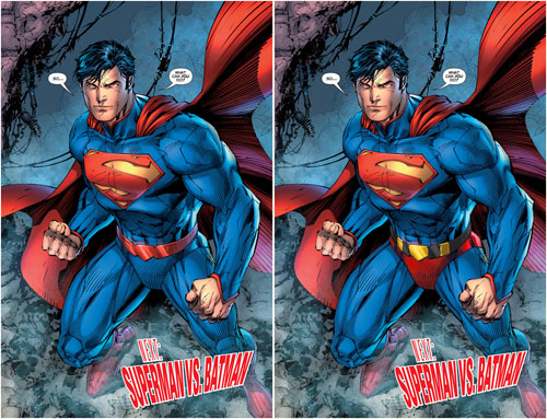
And in this case, like long armoured underwear. But it was decided that having red shorts was too silly (as if the new designs don’t look silly), So the shorts HAD to go. Although, notice how Superman still has shorts, They are simply coloured the same as the rest of his long underwear. And why does he even NEED armour?? He’s the goddamn Superman!! And will he wear it under his street clothes?? So many questions. ;)
But other than pretty much all the new costumes being some sort of weird armours with a lot of useless superfluous lines, the problem with them new designs seems to stem from Jim Lee. (yes I know that apparently he did not do all the design work himself, but he was the lead designer, whatever the other designers did, they were following his lead)
I like Jim Lee’s artwork. Heck I bought his Wolverine/Punisher prints many winters ago when not many seemed to care about his work.
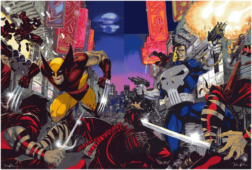
But when it comes to designing costumes, he is the last person on Earth you want to ask to.
Heck just looking at his dog collared Green Lantern design should be self-explanatory.
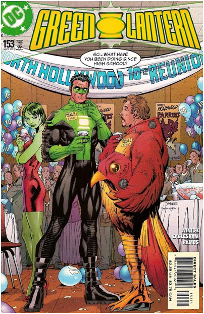
But let’s look deeper than that. The biggest problem with Jim Lee’s design is that often, the design looks good when drawn by Jim Lee, But looks like crap when anyone else is drawing it. There are many reasons behind that.
I don’t know if you guys remember?? A few winters ago, in one of my blogs I mentioned how in order to tell if a design was strong or not, an easy way to do that was to draw the character in a neutral pose. That way you can look at the design itself and not let the pose distract you from the design. And that sometimes, an artist would try to save a poor design by putting the character in a dynamic pose to distract the eye into looking at the strong pose, and not seeing the weak design. That is in part what Jim Lee does.
When you look at a Jim Lee drawing, often the artwork is strong enough, that any weakness there might be in the design is pretty much ignored by the untrained eye. Also, when Jim Lee designs a character, it is closely linked to the way he draws. The way his design is structured is linked with the way that he does structure his characters as he draws. So once another artist, that does NOT structure his characters in a similar way, tries to draw a Jim Lee design, It falls apart. For a Jim Lee design to work, You almost HAVE to draw like Jim Lee. And sadly, Not many can pull it off.
Also, Jim Lee adds a thousand unnecessary lines to his designs, Again that is linked with how he adds a lot of unnecessary lines in his artwork itself. If you cannot figure out why or how Jim Lee adds all them unnecessary lines to his artwork, You will have a tough time pulling it off yourself. So when an artist that does not use much lines tries to draw a Jim Lee design, it usually is a disaster. When Jim Lee takes a Kirby design and adds a thousand lines to it, the design is strong enough that it still works. But when you take a Jim Lee design and try to draw it without adding a thousand lines to it, It falls apart.
I won’t complain about the designs being skin tight armour. I did not mind when Iron-Man had some skin tight armour, heck I miss his skin tight armour, so I won’t start complaining about it now. But, does Superman really NEED armour?? I know that they are trying to justify it saying that it is some ancient Kryptonian armour, but the truth is, that is how it was designed, and the Kryptonian thing is just an excuse to explain the armoured look for Superman. And if it is an ancient Kryptonian armour, Why does it match with Batman’s armour?? The very first time that Batman and Superman meet, and they NEVER met before, but they both have matching armours?? Does Batman wears an ancient Kryptonian armour as well??
Or why does it have the same collar as the rest of the JL costumes?? Again they never met before. The answer is simple, because they all were designed by the same guy, Jim Lee. And in some cases, it is difficult not to think that it is just Jim Lee trying to put his mark on every single DCnU characters. Look at Green Lantern for example. Thank god for his new design, he is well protected now, he has shoulder pads/armours now. Why?? Just so Jim Lee could put his mark on him. Heck I am surprise that he did not give him some kneepads as well. If all he could add to the Green Lantern design was some useless shoulder pads and some “V” collar, he should have left the design alone.
And for Batman, did they not redesign Batman like 6 months ago with “The return of Bruce Wayne”?? Did he really need a new design, again??... so soon?? I guess someone at DC (Jim Lee???) did not like the yellow Bat oval and HAD to get rid of it?? So they used up this opportunity??
And I won’t go into details about how BAD the new Cyborg design is.
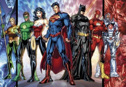
It will take me about a 1000 pages to try and properly explain it, so I will just settle with saying, Damn it is a bad design. So one of the biggest challenge for the DCnU will be to see how many artists can make the new Jim Lee designs look good.
Seeing how the DCnU is a hit, we at the FBU HQ not being complete fools decided to commission Jim Lee to redesign our characters. But since he was not available, we tried to get his Earth “Replacement Killers” counterpart John Lee, but failed to locate the Flash to help us travel to that universe.
So we had to settle for some Mystery Woman who rebooted our FBU into the NEW FBnU as I was running around really fast (at least really fast compared to a turtle) almost giving myself a heart attack in the process. ;) And here is the result:
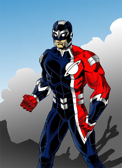
So From now on, Saturn Knight will proudly wear his brand new Uranian Battle Armour, and our comic will be available for digital download on the same day they are released. Go download our comics and buy our new Saturn Knight action figure in his new armour. ;)
But seriously, Jim (probably being tired of hearing me bitching and complaining about all them changes) asked me the $50,000 question:
“I'm curious - how would you have redesigned the Superman costume if Dan Didio came up to you and put a gun to your head (or a million dollars in your lap!)”
Since this Blog is already wayyyy tooo long already, this will have to wait for another time. ;)
Until next time.
-Pierre
Strangely enough, not many reviewers mentioned those. Heck on comicsbulletin.com, the closest we got a mention of the NEW costumes was one of the reviewers saying:
“The last few pages see Green Lantern humbled and Superman introduced. I'm sure other reviewers will have things to say about Superman's new and ugly costume, so I'll just say: gawd, it's effing hideous.”
But strangely enough, none of the other reviewers even mentioned the new costumes. Many posters were vocal about not liking the new costumes, but not many reviewers even mentioned them. Not even to try and defend them. Although they had a tough enough time trying to justify how it was okay for JL#1 to be “underwhelming”, So maybe they did not want to stretch it by trying to defend their armoured long underwear as well. ;)
And that is the first problem with some of them new designs right there. For example for Superman, without the red pants, damn how it looks even more like long underwear.

And in this case, like long armoured underwear. But it was decided that having red shorts was too silly (as if the new designs don’t look silly), So the shorts HAD to go. Although, notice how Superman still has shorts, They are simply coloured the same as the rest of his long underwear. And why does he even NEED armour?? He’s the goddamn Superman!! And will he wear it under his street clothes?? So many questions. ;)
But other than pretty much all the new costumes being some sort of weird armours with a lot of useless superfluous lines, the problem with them new designs seems to stem from Jim Lee. (yes I know that apparently he did not do all the design work himself, but he was the lead designer, whatever the other designers did, they were following his lead)
I like Jim Lee’s artwork. Heck I bought his Wolverine/Punisher prints many winters ago when not many seemed to care about his work.

But when it comes to designing costumes, he is the last person on Earth you want to ask to.
Heck just looking at his dog collared Green Lantern design should be self-explanatory.

But let’s look deeper than that. The biggest problem with Jim Lee’s design is that often, the design looks good when drawn by Jim Lee, But looks like crap when anyone else is drawing it. There are many reasons behind that.
I don’t know if you guys remember?? A few winters ago, in one of my blogs I mentioned how in order to tell if a design was strong or not, an easy way to do that was to draw the character in a neutral pose. That way you can look at the design itself and not let the pose distract you from the design. And that sometimes, an artist would try to save a poor design by putting the character in a dynamic pose to distract the eye into looking at the strong pose, and not seeing the weak design. That is in part what Jim Lee does.
When you look at a Jim Lee drawing, often the artwork is strong enough, that any weakness there might be in the design is pretty much ignored by the untrained eye. Also, when Jim Lee designs a character, it is closely linked to the way he draws. The way his design is structured is linked with the way that he does structure his characters as he draws. So once another artist, that does NOT structure his characters in a similar way, tries to draw a Jim Lee design, It falls apart. For a Jim Lee design to work, You almost HAVE to draw like Jim Lee. And sadly, Not many can pull it off.
Also, Jim Lee adds a thousand unnecessary lines to his designs, Again that is linked with how he adds a lot of unnecessary lines in his artwork itself. If you cannot figure out why or how Jim Lee adds all them unnecessary lines to his artwork, You will have a tough time pulling it off yourself. So when an artist that does not use much lines tries to draw a Jim Lee design, it usually is a disaster. When Jim Lee takes a Kirby design and adds a thousand lines to it, the design is strong enough that it still works. But when you take a Jim Lee design and try to draw it without adding a thousand lines to it, It falls apart.
I won’t complain about the designs being skin tight armour. I did not mind when Iron-Man had some skin tight armour, heck I miss his skin tight armour, so I won’t start complaining about it now. But, does Superman really NEED armour?? I know that they are trying to justify it saying that it is some ancient Kryptonian armour, but the truth is, that is how it was designed, and the Kryptonian thing is just an excuse to explain the armoured look for Superman. And if it is an ancient Kryptonian armour, Why does it match with Batman’s armour?? The very first time that Batman and Superman meet, and they NEVER met before, but they both have matching armours?? Does Batman wears an ancient Kryptonian armour as well??
Or why does it have the same collar as the rest of the JL costumes?? Again they never met before. The answer is simple, because they all were designed by the same guy, Jim Lee. And in some cases, it is difficult not to think that it is just Jim Lee trying to put his mark on every single DCnU characters. Look at Green Lantern for example. Thank god for his new design, he is well protected now, he has shoulder pads/armours now. Why?? Just so Jim Lee could put his mark on him. Heck I am surprise that he did not give him some kneepads as well. If all he could add to the Green Lantern design was some useless shoulder pads and some “V” collar, he should have left the design alone.
And for Batman, did they not redesign Batman like 6 months ago with “The return of Bruce Wayne”?? Did he really need a new design, again??... so soon?? I guess someone at DC (Jim Lee???) did not like the yellow Bat oval and HAD to get rid of it?? So they used up this opportunity??
And I won’t go into details about how BAD the new Cyborg design is.

It will take me about a 1000 pages to try and properly explain it, so I will just settle with saying, Damn it is a bad design. So one of the biggest challenge for the DCnU will be to see how many artists can make the new Jim Lee designs look good.
Seeing how the DCnU is a hit, we at the FBU HQ not being complete fools decided to commission Jim Lee to redesign our characters. But since he was not available, we tried to get his Earth “Replacement Killers” counterpart John Lee, but failed to locate the Flash to help us travel to that universe.
So we had to settle for some Mystery Woman who rebooted our FBU into the NEW FBnU as I was running around really fast (at least really fast compared to a turtle) almost giving myself a heart attack in the process. ;) And here is the result:

So From now on, Saturn Knight will proudly wear his brand new Uranian Battle Armour, and our comic will be available for digital download on the same day they are released. Go download our comics and buy our new Saturn Knight action figure in his new armour. ;)
But seriously, Jim (probably being tired of hearing me bitching and complaining about all them changes) asked me the $50,000 question:
“I'm curious - how would you have redesigned the Superman costume if Dan Didio came up to you and put a gun to your head (or a million dollars in your lap!)”
Since this Blog is already wayyyy tooo long already, this will have to wait for another time. ;)
Until next time.
-Pierre
Sunday, September 18, 2011
My Bozo The Robot Pitch
Because of the DC Relaunch, James Robinson was forced to cut short his tenure on Justice League of America (which seems to have come to the relief of many people who were reading the title.) I can't really weigh in on the issue except to say that in his last issue of the series, he gave us a a metatexual finalie with glimpse of some of the stories he had planned, wherein this page intrigued me (click to see the full page)

A closer look at this page reveals this caption (in black)

This is not only a reference to one of my favorite Golden Age characters, Bozo the Robot, but also it references a (thankfully) aborted idea by the team behind the last incarnation of Freedom Fighters.
First some backstory for those of you unfamiliar with Bozo the Robot (and welcome to my blog because this sure ain't the first time I've talked about him.) Bozo is a character from Quality Comics SMASH COMICS who ran on the cover of the first issue and ran in the series until issue 42. He has always been a favorite of mine, and I've featured him here several times in the past.
Being named James and liking Bozo seems to be two traits I have in common with Mr. Robinson as he once included a nice cameo of Bozo in his Starman run. The reference to Gonzo here is a wink towards a character created by Justin Gray and Jimmy Palmiotti that they had a character concept for a villain called Gonzo the Mechanical Bastard that was derived from a character proposal by Grant Morrison, which was to have been an update of Bozo.
Yeah, that's what we need.
A grim and gritty version of a whimsical robot character.
Being a fan of Bozo, and hearing people talk about Robinson's run on JLA, I am sorta glad that the only glimpse of this incarnation we will ever have to endure is limited to a caption box. Still, you know someone is eventually get around to doing something with this character. And based on current trends at DC, I suspect the words BAD ASS will be in the pitch.
You know who would be good on a Bozo Revamp? Me and Pierre! I know that sounds crazy but man, I think Pierre would perfect for sort of CC Beckish take on Bozo the Robot. I would totally use the character to tell whimsical, pseudo-sci-fi stories in a sprawling metropolis much in the same way CC Beck used to do with Captain Marvel.
Here's my Bozo the Robot Pitch:
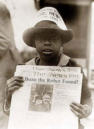
Our story begins with Bozo being awakened after untold years of hyper-electric hibernation in what seems to be the basement of an old museum. The waker is a newspaper boy whose arms are covered with strange tattoos. The boy doesn't seem to be able to talk, but points to one of the tattoos, which is a perfect likeness for Bozo. In the boys hands is a newspaper with the headline: Bozo the Robot Found!

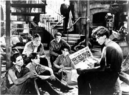
The boy leads Bozo up the stairs of the museum where he meets a group of street ruffians who call themselves the Holiday Hooligans.

The Hooligans tell Bozo that he is in the city of Halcyon, and that they live in the museum, which has been long abandoned since before the start of the great war. The boy who awakened Bozo is named Quiet Quincy because he is mute. The leader of the boys is a troubled soul with a gimp leg nick-named Crabby Abby. They make their way in the world selling newspapers and in their off time patrol the city looking for adventure and solving any mysteries they encounter. As it turns out, Halcyon is indeed full of mysteries!
Bozo discovers that while this city resembles the era he was created in (1940's) it is not that time. Nor is it easy to determine what time it is, as NONE of the newspapers (or anything for that matter) have a date on them! Also, Halcyon appears to be a city without boundries, as the blocks go on forever. Strangest of all, the tattoos on Quincy's body seem to be images of events that will unfold in the future, and Quincy himself often disappears for a day, only to return with newspapers with tomorrows headlines. It was one of these very newspapers that led him to Bozo in the first place.
As Bozo joins the Hooligans on their adventures he meets other inhabitants of Halcyon:
There is an oriental homeless man Shang Rila who claimes to be the last of a mystic order that guarded a temple beneath Halcyon that can be only accessed by traveling through a deserted subway station.

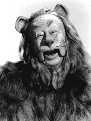
Protecting Halcyon's lone library is the timid half-man, half-lion creature known as The Loquacious Mr. Leo, who knows more about Halcyon than anyone, but will only share his information in return for a favor. No one knows where Mr. Leo came from or why he is the only such creature of his kind.

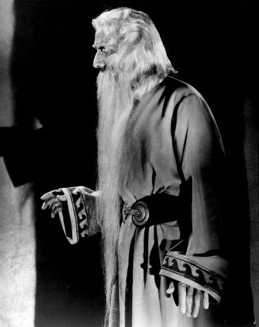
A constant source of trouble for the Hooligans is the Dr. Savantus, a man who promotes himself as a brilliant scientist, but his inventions often seem to deviate so wildly in design that Bozo questions if he is actually the creator or simply an unwitting tester of some sort.

Above all these enigmatic characters is the merciless Cardiff Cadaver. A ghastly ghoul with moon-white skin dressed in a tattered tux who roams the nightime streets of Halcyon destroying anyone who gets in his way as he pursues some mad quest that only he is privy too. It was the Cadaver who crushed Abby's leg. Since that day, the Hooligans have been on the lookout for this white widowmaker in hopes of taking him down.

If I made this a 6 issue mini-series, I would have Bozo discover some, but not all of the mysteries above, while keeping a light-hearted tone to the series. By the by, I would be remiss if I were not to say that some of the inspiration for this idea and the format for this post comes from Trey Causey's ever creative Weird Adventures RPG Setting.
So until DC calls me up to offer me this dream job, (or Pierre gets tired dissing the DC Relaunch ;) ) check out this great issue of Smash Comics which features Bozo on the cover: [ Smash Comics 26 ]

Enjoy!
- Jim

A closer look at this page reveals this caption (in black)

This is not only a reference to one of my favorite Golden Age characters, Bozo the Robot, but also it references a (thankfully) aborted idea by the team behind the last incarnation of Freedom Fighters.
First some backstory for those of you unfamiliar with Bozo the Robot (and welcome to my blog because this sure ain't the first time I've talked about him.) Bozo is a character from Quality Comics SMASH COMICS who ran on the cover of the first issue and ran in the series until issue 42. He has always been a favorite of mine, and I've featured him here several times in the past.
Being named James and liking Bozo seems to be two traits I have in common with Mr. Robinson as he once included a nice cameo of Bozo in his Starman run. The reference to Gonzo here is a wink towards a character created by Justin Gray and Jimmy Palmiotti that they had a character concept for a villain called Gonzo the Mechanical Bastard that was derived from a character proposal by Grant Morrison, which was to have been an update of Bozo.
Yeah, that's what we need.
A grim and gritty version of a whimsical robot character.
Being a fan of Bozo, and hearing people talk about Robinson's run on JLA, I am sorta glad that the only glimpse of this incarnation we will ever have to endure is limited to a caption box. Still, you know someone is eventually get around to doing something with this character. And based on current trends at DC, I suspect the words BAD ASS will be in the pitch.
You know who would be good on a Bozo Revamp? Me and Pierre! I know that sounds crazy but man, I think Pierre would perfect for sort of CC Beckish take on Bozo the Robot. I would totally use the character to tell whimsical, pseudo-sci-fi stories in a sprawling metropolis much in the same way CC Beck used to do with Captain Marvel.
Here's my Bozo the Robot Pitch:
Our story begins with Bozo being awakened after untold years of hyper-electric hibernation in what seems to be the basement of an old museum. The waker is a newspaper boy whose arms are covered with strange tattoos. The boy doesn't seem to be able to talk, but points to one of the tattoos, which is a perfect likeness for Bozo. In the boys hands is a newspaper with the headline: Bozo the Robot Found!

The boy leads Bozo up the stairs of the museum where he meets a group of street ruffians who call themselves the Holiday Hooligans.

The Hooligans tell Bozo that he is in the city of Halcyon, and that they live in the museum, which has been long abandoned since before the start of the great war. The boy who awakened Bozo is named Quiet Quincy because he is mute. The leader of the boys is a troubled soul with a gimp leg nick-named Crabby Abby. They make their way in the world selling newspapers and in their off time patrol the city looking for adventure and solving any mysteries they encounter. As it turns out, Halcyon is indeed full of mysteries!
Bozo discovers that while this city resembles the era he was created in (1940's) it is not that time. Nor is it easy to determine what time it is, as NONE of the newspapers (or anything for that matter) have a date on them! Also, Halcyon appears to be a city without boundries, as the blocks go on forever. Strangest of all, the tattoos on Quincy's body seem to be images of events that will unfold in the future, and Quincy himself often disappears for a day, only to return with newspapers with tomorrows headlines. It was one of these very newspapers that led him to Bozo in the first place.
As Bozo joins the Hooligans on their adventures he meets other inhabitants of Halcyon:
There is an oriental homeless man Shang Rila who claimes to be the last of a mystic order that guarded a temple beneath Halcyon that can be only accessed by traveling through a deserted subway station.

Protecting Halcyon's lone library is the timid half-man, half-lion creature known as The Loquacious Mr. Leo, who knows more about Halcyon than anyone, but will only share his information in return for a favor. No one knows where Mr. Leo came from or why he is the only such creature of his kind.

A constant source of trouble for the Hooligans is the Dr. Savantus, a man who promotes himself as a brilliant scientist, but his inventions often seem to deviate so wildly in design that Bozo questions if he is actually the creator or simply an unwitting tester of some sort.

Above all these enigmatic characters is the merciless Cardiff Cadaver. A ghastly ghoul with moon-white skin dressed in a tattered tux who roams the nightime streets of Halcyon destroying anyone who gets in his way as he pursues some mad quest that only he is privy too. It was the Cadaver who crushed Abby's leg. Since that day, the Hooligans have been on the lookout for this white widowmaker in hopes of taking him down.

If I made this a 6 issue mini-series, I would have Bozo discover some, but not all of the mysteries above, while keeping a light-hearted tone to the series. By the by, I would be remiss if I were not to say that some of the inspiration for this idea and the format for this post comes from Trey Causey's ever creative Weird Adventures RPG Setting.
So until DC calls me up to offer me this dream job, (or Pierre gets tired dissing the DC Relaunch ;) ) check out this great issue of Smash Comics which features Bozo on the cover: [ Smash Comics 26 ]

Enjoy!
- Jim
Friday, September 16, 2011
The Good, The Bad, and The Ugly review 1
With so many comic books coming out so fast right now Caine will be looking at different ways to review them - such as reviewing more than one per post. Just so you know, we are less concerned about spoilers blogging at this speed (we are all ready a week behind), but if you still haven't read the first round of the new DC 52, there be some spoilers below.
I have to say that when reading the comics that came out on the 7th, three of them truly did fit into the following categories:
THE GOOD:
Batgirl
Unless you've been living under a rock you've no doubt heard that Barbara Gordon (formerly ORACLE in the old DCU) is back to being Batgirl. There have been no shortage of blogging, social media, and message board posts on the fact that Barbara (and many other characters) will be de-aged and given the use of her legs back. Legs she'll need as she's once again BATGIRL!
Gail Simone (who was an advocate for Barbara being the only Batgirl in the DCnU from the beginning) and crew have done an excellent job! This was a great read and a book that I'll be picking up. There isn't a single fear that anything in her history was removed or severely altered, if that's what you were worried about you can throw a batarang at it because it's all there. Yes, yes, that includes the Killing Joke and the loss of her legs. Barbara simply had far less time without the use of them is all. Was she ever actually Oracle? They haven't said yet one way or another, and Idoubt they will hope they don't for a while. Dish it out slowly is what I say. Her relationship with her father, a new room mate and friend and (more than likely) the Batman is out there too.
This is an action adventure comic book staring a relatively new person in a cape and cowl to make it even more interesting. This was a fast paced read filled with kicks to the face, characters freezing up and making mistakes, leaving black rubber all over the street, and a new villain (or two) that one could sink their teeth into.
THE BAD:
StormWatch
You see a long time ago in a galaxy far away there were these six comic book creators who went to Marvel and said....then Jim Lee sold his imprint WildStorm back to DC and those books were never the same. I kinda thought, what with Jim being a DC big wig these days, that those WildStorm titles returning to print would be good again. I was wrong.
Dead wrong I'm afraid. "There can be only one" kind of wrong in fact. This book wasn't any good at all. First of all it's not StormWatch as one might be led to believe - what with that name printed on the cover and all. Confusing I know. The book is actually a hybrid of StormWatch and The Authority but here's the thing: The Authority was created specifically to be the opposite of StormWatch. How does it make sense to combine them into one book? Won't half of the fans of each book be misled and ticked off to one degree?
This book is messy. The plot jumps all over the place right out of the gate. They begin introducing characters we've never seen before and have no vested interest in and leave us right where they leave us on Justice League. The page posted is the last page of the comic, as if you couldn't see that coming. I sure as hell Grifter is better than this.
THE UGLY:
Hawk & Dove
You see a long time ago in a galaxy far away there were these six comic book creators who went to Marvel and said....then Robert Liefeld got into some trouble, more than once. Still, he works professional in comic books and I don't so you can't bee to hard on the guy right? He's stated all over the place that he has been focused on turning in work on time for the last couple of years. He's tweeted art work and his thoughts on the industry. His work seemed to be, to this blogger, looking more realistic and of better quality but like Nicholas Cage he seems to be phoning it in these days.
I could pick this apart but I don't think I need to. It just doesn't look that good. Not at all. I know people call Liefeld "Polarizing" meaning everyone either loves or hates the guys work but it's ridiculous. Early on, before they become zombies, the bad guys are dressed in suits that look just like SHIELD field agents. When Hank "Hawk" Hall is out of uniform and talking to his father (like Barbara Gordon and Dick Grayson Hank has been de-aged), both characters look the same. Who do they look like? Robert Liefeld. Funny enough it would seem that Hank Hall and Dawn Granger have suffered the fate that Barbara Gordon didn't: The Teen Titans have been seemingly erased from existence like a leak in the flux capacitor.
Final Thoughts
While I was writing this I was on twitter and a famous comic book writer gave me a thought regarding the DC Relaunch: "Execution is different on different books." I'd say that hits the nail on the head right there. H&D and StormWatch were not good examples of "new", "fresh", or "open" in order to attract new fans to what was undoubtedly an unsustainable business model of decreasing fan bases. Both of them are steeped in character lore and relationships that have not yet been shown to us yet and may not for some time. Or character relationships that weren't popular the first time around and are probably not well known to the masses. Both of them are messy and all over the map story wise. H&D is down right ugly and doesn't feel like anything close to what it was before, or even like it should be one of the "Young Justice" books it's being released under.
This bloggers hopes lie with Batwoman and Nightwing (as usual).
~Caine
I have to say that when reading the comics that came out on the 7th, three of them truly did fit into the following categories:
THE GOOD:
Batgirl
Unless you've been living under a rock you've no doubt heard that Barbara Gordon (formerly ORACLE in the old DCU) is back to being Batgirl. There have been no shortage of blogging, social media, and message board posts on the fact that Barbara (and many other characters) will be de-aged and given the use of her legs back. Legs she'll need as she's once again BATGIRL!
Gail Simone (who was an advocate for Barbara being the only Batgirl in the DCnU from the beginning) and crew have done an excellent job! This was a great read and a book that I'll be picking up. There isn't a single fear that anything in her history was removed or severely altered, if that's what you were worried about you can throw a batarang at it because it's all there. Yes, yes, that includes the Killing Joke and the loss of her legs. Barbara simply had far less time without the use of them is all. Was she ever actually Oracle? They haven't said yet one way or another, and I
This is an action adventure comic book staring a relatively new person in a cape and cowl to make it even more interesting. This was a fast paced read filled with kicks to the face, characters freezing up and making mistakes, leaving black rubber all over the street, and a new villain (or two) that one could sink their teeth into.
THE BAD:
StormWatch
You see a long time ago in a galaxy far away there were these six comic book creators who went to Marvel and said....then Jim Lee sold his imprint WildStorm back to DC and those books were never the same. I kinda thought, what with Jim being a DC big wig these days, that those WildStorm titles returning to print would be good again. I was wrong.
Dead wrong I'm afraid. "There can be only one" kind of wrong in fact. This book wasn't any good at all. First of all it's not StormWatch as one might be led to believe - what with that name printed on the cover and all. Confusing I know. The book is actually a hybrid of StormWatch and The Authority but here's the thing: The Authority was created specifically to be the opposite of StormWatch. How does it make sense to combine them into one book? Won't half of the fans of each book be misled and ticked off to one degree?
This book is messy. The plot jumps all over the place right out of the gate. They begin introducing characters we've never seen before and have no vested interest in and leave us right where they leave us on Justice League. The page posted is the last page of the comic, as if you couldn't see that coming. I sure as hell Grifter is better than this.
THE UGLY:
Hawk & Dove
You see a long time ago in a galaxy far away there were these six comic book creators who went to Marvel and said....then Robert Liefeld got into some trouble, more than once. Still, he works professional in comic books and I don't so you can't bee to hard on the guy right? He's stated all over the place that he has been focused on turning in work on time for the last couple of years. He's tweeted art work and his thoughts on the industry. His work seemed to be, to this blogger, looking more realistic and of better quality but like Nicholas Cage he seems to be phoning it in these days.
I could pick this apart but I don't think I need to. It just doesn't look that good. Not at all. I know people call Liefeld "Polarizing" meaning everyone either loves or hates the guys work but it's ridiculous. Early on, before they become zombies, the bad guys are dressed in suits that look just like SHIELD field agents. When Hank "Hawk" Hall is out of uniform and talking to his father (like Barbara Gordon and Dick Grayson Hank has been de-aged), both characters look the same. Who do they look like? Robert Liefeld. Funny enough it would seem that Hank Hall and Dawn Granger have suffered the fate that Barbara Gordon didn't: The Teen Titans have been seemingly erased from existence like a leak in the flux capacitor.
Final Thoughts
While I was writing this I was on twitter and a famous comic book writer gave me a thought regarding the DC Relaunch: "Execution is different on different books." I'd say that hits the nail on the head right there. H&D and StormWatch were not good examples of "new", "fresh", or "open" in order to attract new fans to what was undoubtedly an unsustainable business model of decreasing fan bases. Both of them are steeped in character lore and relationships that have not yet been shown to us yet and may not for some time. Or character relationships that weren't popular the first time around and are probably not well known to the masses. Both of them are messy and all over the map story wise. H&D is down right ugly and doesn't feel like anything close to what it was before, or even like it should be one of the "Young Justice" books it's being released under.
This bloggers hopes lie with Batwoman and Nightwing (as usual).
~Caine
Subscribe to:
Posts (Atom)